Times are a-changin’ faster than ever, which makes keeping up with the latest trends a bit trickier than before. And when web design is in question, the current frenzy is even less likely to last. Besides, the website is the virtual employee buy-in of every business and whatever your chosen field of online work may be, it has to represent it in the most suitable manner – with efficiency, responsiveness and style.
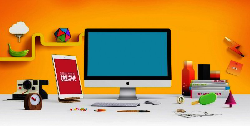
Furthermore, not every last word of web design fashion can be adapted to suit the specific properties of your service and customers you want to attract. With that taken into consideration, take a look at some of the most popular trends at the moment.
Smooth Experience
Whatever your brand is selling, its top priority is to attract and convince the buyer to make a purchase – and the most effective way of doing that is with storytelling. Web design has seen a current of trends over the past few years, but the one thing all of them have in common is the smoothness of the user experience. Methods of achieving such effects are various, but they all promote flow and simplicity as the most important parts of the journey. Here’s how:
One step at the time: So, you already have your mind set on the pattern, but you still have to figure out the way to incorporate an account registration form without making it too intrusive. There is not a user in the world who finds them exciting, so you’ll need to be extra careful when designing this step. The easiest solution for both you and your future users is, of course, replacing the registration with a social sign-in. If you’re still determined to go for a traditional approach, consider eliminating as many form fields as possible or designing a multi-step form wizard, which reduces friction and gives some flow to the overly dull process.
Brick by brick: With Pinterest boards and the newest Windows tile design, card layouts are now flooding the web. The reason is obvious – the card layout neatly divides information, making it transparent and easy to scan. Each tile or card acts as a content container practical for filing and arranging different types of information, and with that, effortless to choose and read.
Hovering about (and other animations): Motion is what attracts the eye, which is why no website can do without at least one appropriate animation. While slideshows are the obvious choice for grabbing the user’s attention with imagery and presenting the brand at the same time, they are still not the only type of animation you should consider. Hidden menu animations provide uncluttered homepage space and are equally important to contemplate.
Unlike those that you can incorporate into your design, but don’t have to, loading animations are absolutely indispensable for most websites; they help the impatient user weather the annoying waiting experience, so they need to be thoughtfully crafted to soothe and entertain. Speaking of flow, hover effects are the most popular intuitive way of instantly informing users about the content hiding behind the picture without being invasive or hindering.
Staying inconspicuous: Another way of luring visitors and presenting your online persona or business is with an animated background. When executed with moderation and delivered in subtle motions, this solution gives a clean look and adds visibility without distracting the viewer. The more motion you choose, the more careful you should be; in order to avoid risks, opt for simple, tranquil effects and get creative with sea waves, rain or flickering dust.
Flat & Material
Not so long ago, minimalism was considered avant-garde; surviving the trend shift, it quickly became classic and by now, it is perfectly clear that it’s not going anywhere soon. By its aesthetic nature, this long-lasting trend has everything it takes for a smooth, enjoyable user experience – tidy, polished look, fluid responsiveness and accessible, yet unobtrusive content. Now, it’s applicable to web design in two similar variants:
Flat design: As a style of UI which proves that less is more, flat design uses three dimensions, a flat colour palette and simple typography in order to extremely streamline the user experience. The combination of these elements is perfect for both users and designers – uncomplicated typefaces, as well as the subtle colour scheme keep the text visible and easy to adapt to various sizes and types of browsers across different devices. The design includes basic animation (hover effects fit nicely into the flat concept) and ghost buttons, which allows simple and functional navigation through the website.
Material design: Pioneered by Google in 2015, this style language is nothing more than a slightly more vivid take on flat design. Unlike its predecessor, material design enhances the depth by playing with longer shadows and movements. In most cases, minimalism is enriched with colour schemes that are more vibrant. Every modification, however undetectable it may be, has been made with a single purpose – to make the UI more realistic.
Responsiveness On-The-Go
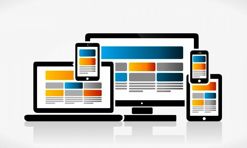
Mobile or not, the web is all about accessibility nowadays, and modern customers have no time and zero tolerance for user interfaces that are slow, complicated and overburdening to use. In order to make your website mobile-responsive, you’ll need to think size and layout, which means adjusting the design to automatically fit four different screen sizes – the widescreen desktop, the laptop screen, tablet and mobile phone. That being said, instantly zooming in or out isn’t the whole secret of this web design conundrum, but only its technical side.
Essentially, the whole website should be designed to predict and solve whatever problem occurs at the moment – if a user approaches your website via mobile phone, which is something we all do on a regular basis, it probably means that they need their information fast. Content layout is, therefore, the priority of mobile responsiveness, so be sure to make it adoptable for an easy and direct approach through each of the devices.
Human Touch
Another thing you should consider is how your digital data relates to the user. As we are condemned to spend our time with machines, a bit of human touch is always welcomed. Artificial intelligence imitates human-to-human relations with conversation and intuition, which is something you should definitely include in your website design. And with the newest digital possibilities, it’s now easy to do. Motion effects and hero images are the simplest way of making digital data realistic and susceptible to the senses, but micro-interactions are the soul of humanizing the user experience.
Micro-interactions are all the ways in which you make contact with an interface, from turning the phone alarm clock off to pinning the image on the Pinterest board. Momentary and imperceptible, these interactions are far more user-friendly when made human instead of robotic. A simple thank you or goodbye is a good start in making your web design more human-centered.
As much as rebellion is a feature of visionaries, your online followers are most likely to follow trends. Your website can, and should differ from your competition, but it should never be outdated and inaccessible. To be unique, but responsive, find a middle between the way you personally want to represent yourself in the online world and the novelties the audience expects. Ultimately, it’s a fine and artistically creative way of gathering more clicks and reaching new customers, viewers and devotees.
