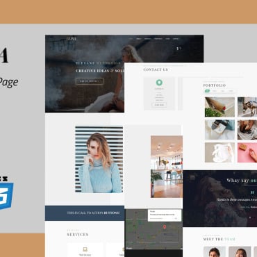
When designing a website, it’s important to remember that the right design for one site may not be ideal for another. You need to design a website that reflects your unique brand or identity.

For example, perhaps you’re a CPA or you run an accounting firm and you want to design a website that will attract clients. Or, maybe you’re offering a CPA exam review course, and your goal is to design a site that makes your course more appealing to potential customers.
In either case, your site’s design should give a visitor a basic sense of professionalism and reliability. Design tips to keep in mind include:
Have Personality
Don’t make the common mistake of assuming that “professional” is the same as “boring.’ Sure, your website’s design may not be as vibrant and dynamic as that for, say, a dating app aimed at young and hip users. However, it also doesn’t need to be so generic that it doesn’t have an identity of its own.
A little bit of color can add a lot of much-needed personality to a dull website. You may want to research color theory and color psychology to ensure you’ve chosen colors that will elicit positive feelings in visitors.
Use Professional Photos
If you run an accounting firm, your website will likely include bios and headshots of yourself and other key members of the firm. You might want to include these on the front page to add even more of a personal identity to your site. If so, make sure you’re all wearing clothes of a similar style, you all have the same background, all photos are taken from the same angle and distance, and, of course, all photographs are professional-looking. Maintaining a certain degree of consistency across your headshots can more firmly establish your brand.
Limit Font Changes
You shouldn’t necessarily use the same exact font for all text on your website. In fact, using a different font and size for an important piece of text, such as a call to action, can help it stand out.
However, for a professional website, it’s best to avoid using more than three fonts on a given page. Most pages should also feature the same basic fonts as each other. Using too many fonts can make your design feel unwieldy and unprofessional.
It’s also important to choose fonts that have just the slightest degree of character and identity. Once more, you don’t want to be bland and forgettable, but you need to give your audience the sense that you’re a trustworthy expert.
Naturally, you must also select fonts that can be easily read on both a desktop computer and smartphone screen. This is particularly important now, as mobile browsing has become more common than desktop browsing. In general, people need to be able to easily read your website on small devices.
Just remember that you can always change your website’s design if it doesn’t help you achieve your goals. That said, it’s less likely this will be necessary if you apply these tips.