Coming up with designs for a brand or business that stands the test of time might seem a little daunting, especially for graphic designers who are just starting out in the domain. Graphic design is synonymous with creativity and out-of-the-box thinking. Therefore, designers might not necessarily have to follow a rulebook or a blueprint while designing a company’s logo or website.

As a designer, you have the license to use different types of colors, fonts and follow fresh methodologies while creating. However, all that said, there might be a few things that can mar the project you are working on and drive away prospective clients and customers. The key function of graphic designers is to come up with visually striking images, logos, infographics and the like to grab the eyeballs of customers and serve the purpose of the business. Your graphics are supposed to pique the interest of the customers and spur them into action.
Therefore, if the social media advertisement or the logo of the brand that you designed fails to get people to act in a certain way, you fail as a designer. Thus, although you are not required to adhere to any strict designing rules, it is wise to take note of some rookie mistakes that designers often make and avoid them on any project you work on. That said, let us now look into these mistakes and see how designers can avoid them in any project they undertake.
Using Too Many Fonts:
You might be tempted to use stylish fonts to up your graphic designing game. In all honesty, using some creative fonts in your designs can be appealing to your target audience. But you must know how much is too much and learn to strike a healthy balance. A professional design team like that of Graphically, will always try to abide by the rubrics of minimalism and use as little as possible. If your design uses too many different types of fonts, it might get too distracting, and your target audience might lose focus from the point that is being conveyed.
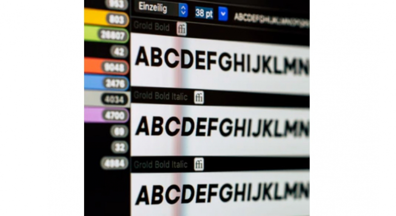
The best thing to do is to use just one type of font. Using a single font in your designs shall not only make your design more impactful but also state the points being conveyed clearly. Besides catering to the kinds of fonts you use in your designs, it is also essential that you determine the perfect font size. You can consider adjusting the spaces between the letters so that the words are legible and also enhance the overall look of the design.
Using Stock Images Unnecessarily:
The whole idea of being a graphic designer is to create your own visuals and images as much as possible. This does not mean that a brand must ditch using stock images. Stock images exist for a reason, and the reason is that people should be able to use these images for free for any project. However, while designing a professional logo, poster or advertisement, using too many stock images can ruin the entire design and drive your customers away.
Always remember that your target audience wants to see something creative and fresh. No one likes to come across images and visuals on ads and campaigns that already exist on the internet. Using the most common stock photos repetitively results in a dead giveaway and is off-putting, to say the least. Your entire marketing strategy might have to bear the brunt of this practice.
Choosing the Wrong Color Palette:
We know what we said at the beginning of the article. Graphic designers are free to use their creativity to choose colors and fonts. However, we also stated that there are a few things that you must keep in mind while doing the same. You are free to experiment and play with colors, but you must also know which combinations complement each other. Choosing colors that are too bright and garish might distract your target audience. Too many bold colors in one design can make it incredibly hard for your target audience to concentrate on the message.

Therefore, even before you start with designing, it is imperative that you first work out a color palette. The color palette that you use must contain primary as well as secondary colors. Run some tests with these colors to see how they would translate into the final product. Only when you see that the colors are not too distracting and are able to send out clear messages, proceed with them.
Not Following the Right Hierarchy:
There is a hierarchy that graphic designers must follow while designing anything. For the uninitiated, hierarchy in graphic designing is the way elements are arranged in a poster, ad or any other format so that the audience knows the importance of each element. For instance, in a poster or a flyer, your logo must always come at the top and be placed before anything else. You must then have the main point that you are trying to get across as the second element and then place every other component and piece of information.
This makes it easy for your audience to glance through everything and also understand everything that the brand is trying to convey. However, if the reverse is followed in designing a flyer, ad or poster, your audience shall get confused about what to pay attention to and which information to discard. Therefore, following a logical hierarchy is very important in graphic design.
Wrapping Up:
These are some of the most important mistakes that even a few seasoned graphic designers tend to make. Understanding these mistakes and how they can ruin the essence of your project can help you avoid the same and create visually striking and impactful designs. There are many more mistakes that you might want to look up and try avoiding. All that said, the best way to learn about these mistakes is by making them first-hand and see how they pan out. Once you have made your own mistakes, you shall be better prepared and aware not to repeat them.
About the author:
Sathish is the founder of Graphically, a leading graphic design company that gives you a dedicated graphics designer for a flat fee. Being a habitual entrepreneur, he has seen the ins and outs of the digital marketing industry and has a proven track of bringing his ideas to life.
Before devoting his time to graphically, Sathish was an SEO consultant, and some of his clients include Hotstar, salesforce, foodpanda, Marriott marquis etc. He has helped hundreds of small businesses drive results in the digital marketing world and now aims to help them in the graphic designing world.


Its not my first time to visit this web site, i am browsing this web site
dailly and obtain good facts from here every day.