When marketing your company through social media, blogging, email marketing, or other means, your landing pages will direct visitors. Rather than offering a general overview of the business as a whole, these landing pages explain a single product or service that you offer and how it benefits a targeted customer.
“Landing pages help you build customer loyalty and increase profits by focusing on a specific short-term goal,” says an article from MailChimp. However, companies can’t meet those goals without the right design.
If your landing pages aren’t gaining the conversions you seek, here are some changes you can make.
Know Your Audience and Goals
You’ll make goals for increasing conversions, but if you don’t understand your audience, you’ll have a hard time reaching them.
“You need to know their likes, dislikes, what sort of content they enjoy and the products they use. If you don’t know the answers to these questions, you’re not going to have much luck when it comes to selling to them,” says Peter Boyle of Crazy Egg.
“You need a clear understanding of your audience so you can clearly identify where their needs overlap with what you’re offering,” he continues. “Without this knowledge, you could end up trying to sell kindergarten services to seniors, or Rogaine to adolescent females.”
Boyle also says that you can never learn enough about your target audience, so it’s a constant learning curve. The more information you gain, the better you’ll understand how to refine your goals and mold your landing page content to gain their attention.
Use Consistent Branding
Your brand should be at the forefront of your customers’ minds the entire time they’re on your website. This means placing your logo strategically on each page, using consistent color schemes and imagery, and mentioning your brand name more than once.
As a great example of consistent branding, look at the website for Impact. As a branding and design company, they’ve mastered the importance of using consistency and strong themes throughout their site. Everything from the text to the color scheme displays their brand and clearly connects visitors with the content that’s helpful to them.
Use Clickable Call-to-Action Buttons
Convincing visitors to perform an action on your page is vital to a successful visit. After you’ve explained the value you can offer to customers, provide buttons that will lead them to the next step, such as signing up for an email newsletter, downloading a free eBook, or moving to a product page.
This law office landing page is a great example of buttons that are compelling and clickable. The page features several call-to action buttons, each using positive text to promote action from the visitor. They’re also brightly worded and shadowed so that viewers have the satisfaction of pushing the buttons.
Be Clear and Concise
Some studies insist that when it comes to internet browsing, human beings have a shorter attention span than a goldfish. This means that you have about seven seconds to grab their attention and convince them to stick around.
Clarity and concision are essential. When a member of your targeted audience lands on your page, they should know within a few seconds exactly what your company does and the product or service it offers.
This style of design and writing involves using bulleted lists, key points, clear headers and sub headers, bolded text or italics, brief points, and targeted images. It should be easy for them to read, understand, and act on without confusion.
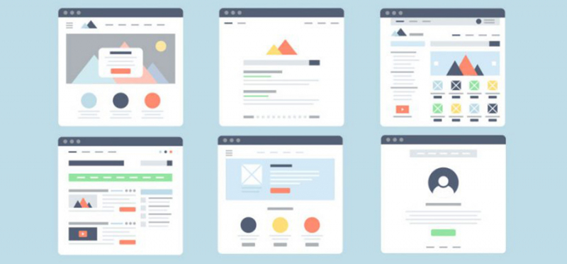
Avoid Visual Clutter
Today’s web design trends are all about simplicity. Less strategically placed content will lead to more high-quality conversions.
“While displaying extravagant visuals on your landing pages may sound like a fabulous idea, A/B tests at HubSpot have repeatedly shown that including too many over-the-top images doesn’t actually help conversion,” says Anum Hussain of Hubspot. “In fact, oftentimes it distracts the reader from the main point of the landing page, creation more friction on the landing page instead of supporting conversion.”
Hussain goes on to discuss how too many visuals can drastically increase load times for your website. Her research shows that if your page load time slows down by just one second, it decreases page views by 11 percent, customer satisfaction by 16 percent, and conversions by 7 percent.
Above all, simple landing pages that have just enough graphics and text to make your point, but that don’t stress out your visitors, is the ideal goal here.

