Grid-style blogs are more popular today than ever before. Several years ago, it was hard to find a blog theme that arranged blog posts in a grid formation. Today, it’s almost a guarantee that high-quality themes will put blog posts into a grid.
What is a grid format?
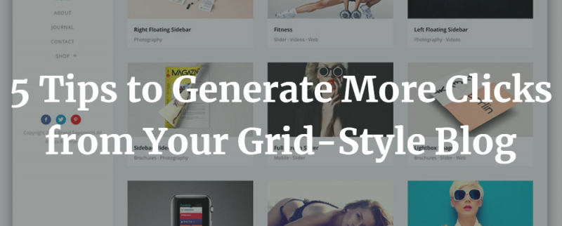
Blog posts in a grid format appear in rows that have anywhere from 2 to 5 (or more) boxes containing a post’s featured image, title, and a snippet of content.
Whether you’re already using a grid or not, here are some tips for generating more clicks from your visitors.
1. Utilize a grid that staggers the post boxes
The perfectionist in you will probably want the top edges of your blog posts to line up perfectly on the horizontal plane. You may even want all post boxes to be the same size. At first glance, this seems like the best option. Why shouldn’t everything be pixel-perfect?
There is so much monotony on the internet today and themes tend to look the same. Having a blog grid that staggers your blog posts within their respective rows will actually work in your favor to hold a user’s attention.
Coupled with great typography and a solid color scheme, staggered grids are more interesting and users will read more titles as they scroll looking for something interesting to read.
2. Reduce the size of your featured image to a narrow rectangle
On each full blog page, your featured image should not take up the entire screen. Plastering gigantic images at the top of any page is a design trend that works against you. Visitors are already short on attention and they just want to get to your content. Having a giant image at the top of your blog pages just makes them have to scroll more to get to the content they were looking for.
Use beautiful photos, but make them smaller all around. Your featured images should highlight your content rather than taking center stage. This applies to the way they appear in your blog’s grid, too.
Use rectangular featured images
In grid format, a scaled-down version of your featured images will appear at the top of each blog’s box. You want this image to be as small as possible to avoid overshadowing the preview content.
Although it might look cool at first glance, square images take up more horizontal space than rectangular images. By using rectangular featured images in your grid layout, you’ll have more space to feature an extra line or two of content.
Rectangles also look more professional than square images. Try it out – you’ll be surprised at how much better your grid layout will look with rectangular images.
3. Use no more than 5 blog posts per row
The optimal number of blog posts per row will vary based on each theme. However, as a rule of thumb, stick to 5 or fewer posts per row. While you might be able to fit more than five in each row, adding more posts to each row decreases readability. At a certain point, increasing the number of blogs per row will work against you.
As you increase the number of blogs in each row, you also decrease the size of each preview box. This reduces the font size and might end up unreadable.
You don’t want a small number of blog posts per row (like 1 or 2) because then the boxes will be huge. Oversized boxes will force people to scroll just to view a handful of posts, which could cause users to bounce.
4. Place your sidebar on the right (if you use one)
When WordPress and other content management systems first came out, the sidebar was traditionally located on the left. Today, it’s more common to place your sidebar on the right.
There aren’t any in-depth studies that say left or right placement is superior. It’s just that people are now used to seeing sidebars on the right. By placing your sidebar on the right where it’s expected, visitors will be more likely to continue browsing your blog without feeling like something is out of place.
5. Don’t use a sidebar with a call-to-action (CTA)
Sidebars are useful, but if your blog content has a critical CTA, it’s better to ditch the sidebar. Your blog sidebar content can distract your visitors from reading and following your CTA. This is supported by a study performed by ImpactBND, which found that removing the sidebar increased conversions.
Want more clicks? Switch to a grid
Your blog’s presentation matters. When done right, grid layouts are a beautiful way to display your content, capture attention, and generate clicks.

