In case you haven’t heard, user experience is the new ranking factor to keep your eyes on.
Although we don’t actually know how much importance search engines attach to UX, what we do know for certain is that users find it incredibly valuable (see what I did there?) – and if it’s good for the user, it’s also good for your SEO.

With that said, let’s explore five ways you can improve your website’s UX and help it make it to the top.
Take care of all things technical
While users won’t be able to see how much time and effort you have devoted to making sure your website loads fast and is optimized well, they will certainly notice when it’s not.
Here is what you should focus on:
- Page loading speeds – If your website takes too long to load, your potential visitors may just give up and leave. By making sure you are hosted on a decent server and that you have taken care of all of the minute technical backend optimization details, you should be able to shave valuable seconds off your loading times.
- Mobile optimization – Since mobile has overtaken desktop as the most commonly used device to access the internet, making sure your pages are easy to use on mobile has become a must. Think in terms of images, text size, loading speeds, and ease of access.
- Website security – Even if you don’t demand any personal information from your users, you want to ensure your website is perfectly secure. Start with an SSL certificate, and depending on the data you store, upgrade your security even further.
Be clever with the white space
Negative space is one of the most important features of modern web design. It helps declutter webpages, it makes them easier on the eyes and easier to navigate, and it can draw attention to the parts of the page you want to promote.
Don’t think of it as empty space. Think of it as space that enhances both your copy and all the other design elements you feature.
Take a look at the website of Electric Wheelchairs USA – their homepage has plenty of white space, but it does not seem empty or boring at any time. This is the kind of design you should be aiming for: easy to digest and cleverly organized.
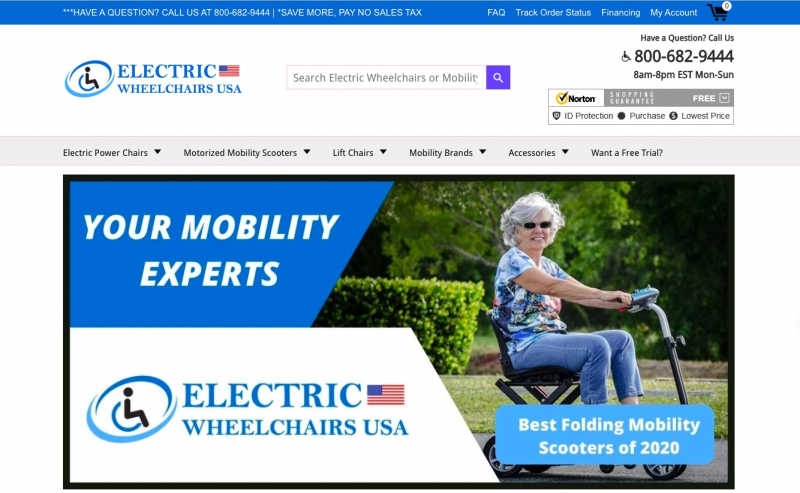
Source: electricwheelchairsusa.com
Write a good CTA
CTAs are there to help inspire action. You may feel that the only purpose they serve is yours, but that is very far from the truth.
A good CTA should help a user do something they already wanted to do: sign up for a newsletter, purchase a product, sign up for a service, get in touch with you. It’s not there as a tool for badgering someone – it’s a gentle nudge.
Having said that, you still want to make sure the CTA is a not-so-subtle nudge, and that users will be able to spot it easily as well as understand what it does.
Here is an example from a neat website, This Is Why I’m Broke, which features very prominent CTAs next to each of the products they mention in their posts. Their color makes them pop, they are large enough to be easily noticed, and they are very clear about what they are doing and where they are taking a visitor.
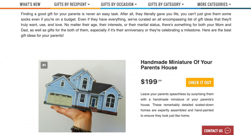
Source: thisiswhyimbroke.com
Make it easy to contact you
Some of your users will have questions – maybe they are not sure how a product works, maybe they have questions about pricing, maybe they are confused about the ordering process.
If they need to call or email you and then wait for an answer for a fair while, it may deter them from converting, or their interest may drop if you take too long to get back to them.
This issue can easily be circumvented by the use of a clever chatbot. It doesn’t have to be intrusive – this one used by Gourmesso is very neat and unobtrusive. You can have one that is smart enough to answer some questions on its own, or at least point the asker in the right direction. Or you can have one that pushes all questions to a live service rep who can take over from there.
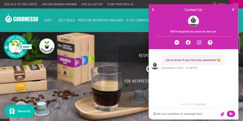
Source: gourmesso.com
Format your posts well
The reality is that most internet users aren’t readers – they are skimmers and scanners.
They don’t like to (or want to) read an entire blog post. They just want to be able to gather the most important information at a glance, and then if they like what they see, read the whole thing.
This is where the importance of formatting for user experience comes in: you need to make your posts skimmable.
This means that you should:
- Number your headings and use different heading tags
- Use bullets and number lists to highlight your points
- Use italics and bold to make certain facts stand out
- Use images and videos to break up your content
- Use internal and external links to provide more information where needed
Of course, how you format your post will depend on its subject, but here is a nice example of a well-formatted blog post from 9 Cloud – it is easy to skim through and only stop at the points that interest a reader the most. It is just the right length and provides all of its most important information at a glance.
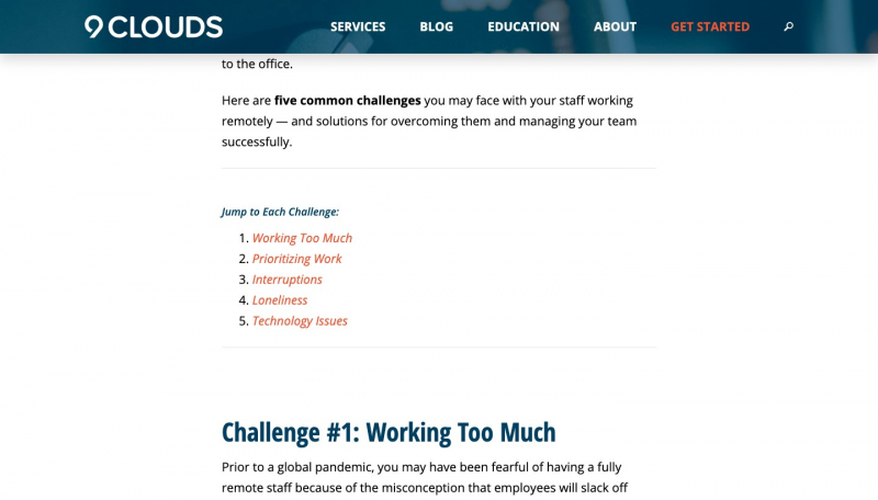
Source: 9clouds.com
To sum it all up
While there is more to UX than what we have outlined here, we hope these tips will get you started in the right direction. Remember to always think about your users – consider what they might want to see and how they might want to see it when designing a page or when publishing a blog post.
The better experience you provide, the more likely people are to want to come back. So investing a bit of time, energy, and resources in getting it right can pay off significantly in the long run.

