Product pages are all about making a sale – the aim is to showcase a product so well that the visitor simply has no choice but to convert.
However, inspiring that conversion is a combined effort of the plethora of elements you choose to feature on your product pages: images, copy, colors, animations. Every little bit has a part to play.
Let’s look at five product page design dos and four don’ts that will help you make sure your pages are up to the task.
Do: Show the price clearly and prominently
Unquestionably, the most important thing users want to see on a product page is the price. Yes, they also want to know a lot about the product, but the price is what matters.
You should make your price stand out, but don’t go overboard. Slightly larger fonts and a color that makes it clearly visible is all you need. You should also place it as close to the Add to Cart button as is reasonable, just so users have a very short way to travel before they click.
Here is this product page for an eyeshadow – the price is only slightly larger than the surrounding copy, yet is prominent enough to be easy to spot.
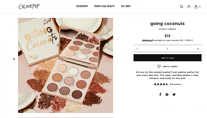
Source: colourpop.com
Do: Show the ingredients clearly
This is especially true for food and beverage brands, but even a clothing brand could benefit from showcasing the materials an item is made from.
Smart shoppers want to know what they’re buying, so if you provide an image of the actual ingredients label, you might encourage them to make a purchase. You are especially more likely to convert cautious shoppers who want to know what they are putting in their bodies.
This product page for an electrolyte drink mix does it really well – they have an image (and it’s the second one in their carousel) that clearly shows the product’s ingredients and nutritional facts, which is super important in their niche.
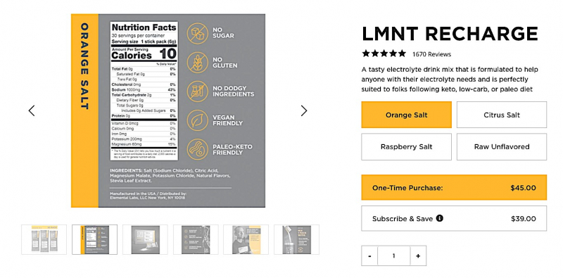
Source: drinklmnt.com
Do: Use plenty of images
Images are vital for product pages. Even if your product is not especially photogenic, you still want to show it from all angles.
Apart from showing more than one still shot of the product, make sure you also show it in action and clearly reference its size – especially for homeware and clothing items. Clearly state the model’s dimensions or the dimensions of the object you feature it next to, to give visitors a clear idea what they’re buying.
It goes without saying that the images need to be unique and of the highest possible quality. You shouldn’t use images from a different website, as that’s only semi-legal and does nothing for your brand.
The product page for this dress clearly shows it on a model, there are shots of it from different angles, and the most prominent features are also shown close up.
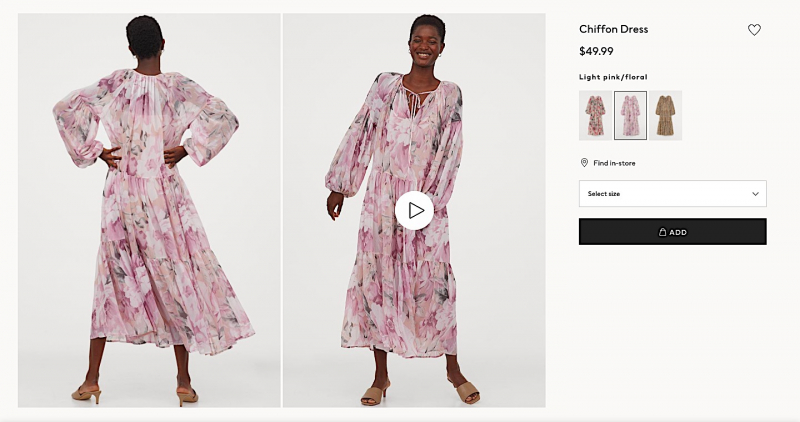
Source: hm.com
Do: Suggest other products
Shoppers often like to see suggestions for other products they might be interested in, especially on large websites where it might take them ages to find that specific product by browsing.
Having a suggestion section can inspire further purchases, but it does need to be done intelligently.
Don’t just suggest random products: suggest products that make sense. You can draw your information from previous purchases and suggest items similar to them, suggest items that are often purchased together, or items you think the particular user will like, based on the likes of similar users.
This book product page does it elegantly and to the point – the suggestions make sense, they are not overpowering, and the product being considered at the moment is still the most prominent one.
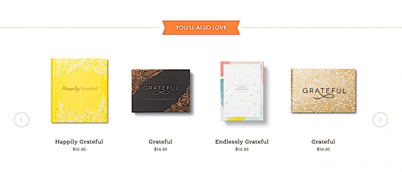
Source: live-inspired.com
Do: Showcase user reviews
User reviews are a great way to boost your conversion rates. They clearly show what others think about a product and how they have put it to use, and they might even address some of the concerns a visitor has.
Make sure your reviews are authentic, though, and that you don’t just select the best ones to be featured. Keeping them honest is more important than making sure they’re glowing.
This product page for a commercial quality espresso machine does it really well. The reviews are easy to read through, authentic, and very relevant to the decision-making process.
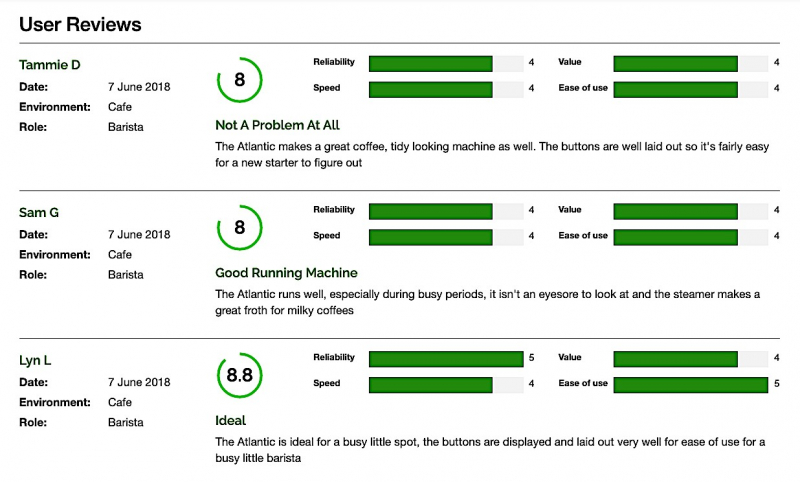
Source: bibium.com
Don’t: Add superfluous information
While you certainly want to offer as much information as necessary for a user to make a purchasing decision, you don’t want to overdo it. List what’s relevant for the product at hand, and leave a link to your FAQs or a contact button where additional questions can be answered. Think of your most general target audience and write for them – anything more specific than that can be answered later on.
Don’t: Borrow descriptions from a manufacturer’s website
All of the copy on your product page needs to be 100% unique – so don’t just go copying words from the manufacturer’s website and using them as your own. You can certainly use them as a guide, but they need to be original to you. This is the place to inject some brand voice and personality.
Don’t: Hide additional costs
If a product comes with extra costs, you need to be upfront about it on the product page. Don’t wait until checkout to slap extra money on top of someone’s order. It makes for a very poor user experience, and it’s a bit deceptive as well.
Don’t: Forget the call to action
CTAs are an essential part of product page design, and they shouldn’t be buried at the very bottom of the page. You can certainly have one there as well, but adding one above the fold is very important, as you want to entice your visitors to convert as many times as possible.
Final thoughts
Product page design is often a process of trial and error, and it might take you a while to craft one that reaches the conversion figures you’re looking for. Stick to the dos and don’ts we’ve outlined above, and you should be well on your way.

