- Outlook does not support background images;
- Gmail mobile app (all platforms) partly supports Responsiveness.
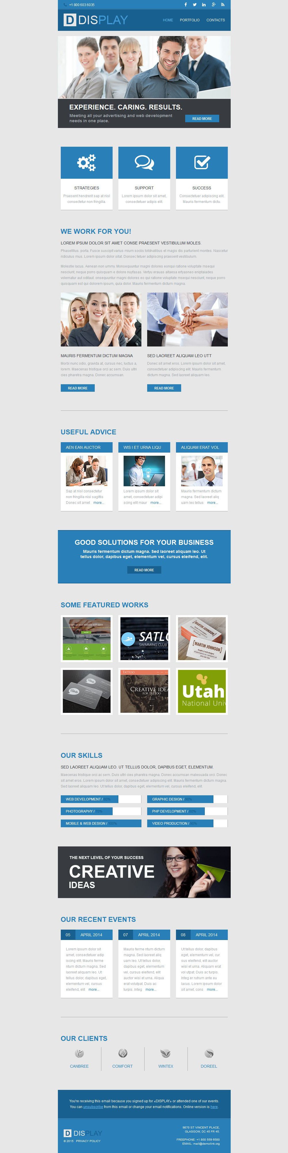
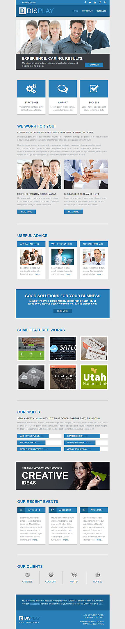
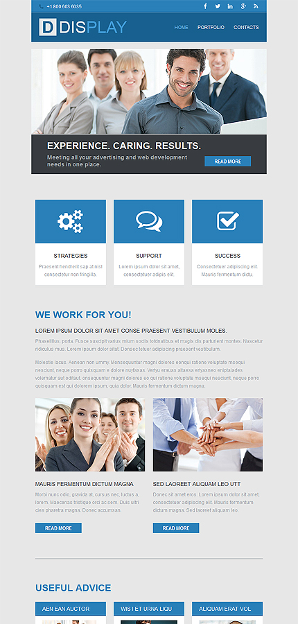
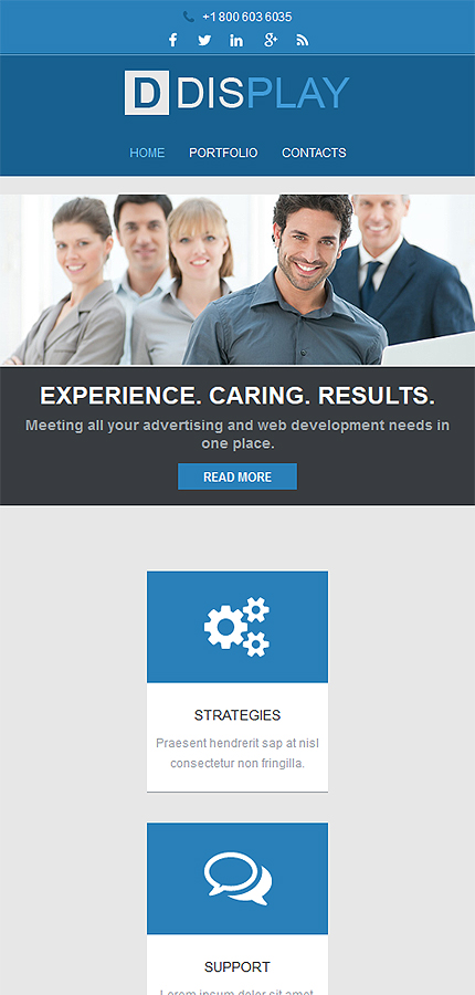
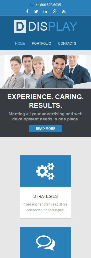
The Web Design Responsive Newsletter Template combines the standard layout of traditional email templates with a new approach and a few interesting elements. Thus, besides having the social media channels and a few important links introduced in the heading, the layout also uses an improved grid structure to present your offers. Even more, you have the possibility to create a stronger bond by introducing the clients to your portfolio and some of your most representative clients.
To make sure all your campaigns are successful, these layouts are adaptable to the email client and the screen size of the reader.
This template is featured in the following editorial reviews:
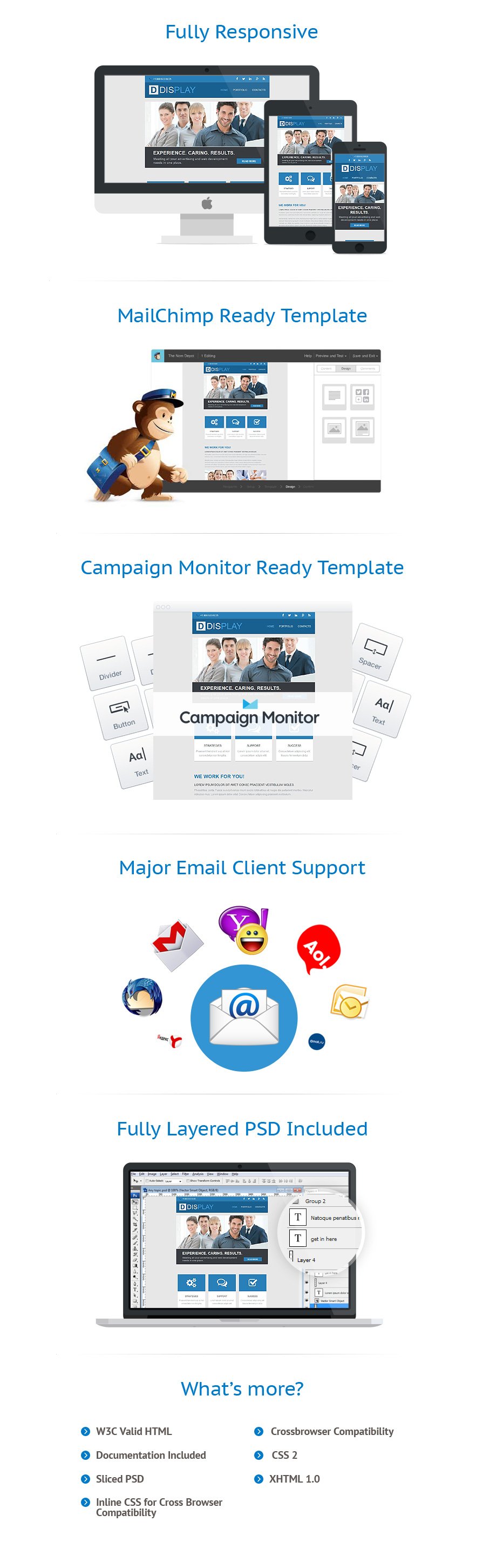
Features
| Author |
WT |
| Package |
Newsletter Template |
| Topic |
Design, Design & Photography, Web Design Templates |
| Marketplace-membership |
One |
| Tags |
advertising, art, artists, creative, design, designers, development, gallery, internet, lab, painters, painting, personal, portfolio, sites, studio, web, webpage |
| Features |
Responsive, Sliced PSD, Static |
| IsFree |
none |
| Lastmod |
2020-07-28T02:21:24-04:00 |
| Layout |
2 columns |
| Type |
Newsletter Templates |
| Width |
680px |
| AdvImage |
https://s.tmimgcdn.com/scr/52600/52682-original.jpg |
Sources Available
HTML PSDSoftware Required
Adobe Photoshop CS+
For uncompressing a template ZIP package: WinZip 9+ (Windows); Stuffit Expander 10+ (Mac)
Sublime Text2 or later, Notepad++
We implemented every best practice in these responsive email newsletter templates, you can be sure you’ll never see any complaints from your newsletter subscribers or low open rate in your campaign statistics.