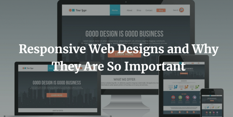
Having a responsive web design is by far the best decision you can make for your website. Thanks to responsive web design, you do not have to re-design your site every time to suit every device that comes into the market. Today, there are many agencies who design responsive websites, like XtremeThemes Shopify agency, so you can easily buy a service. A responsive web design is one which is compatible with a user’s platform and its features. It only has a single set of code which adapts accordingly to various resolutions.
A responsive web design has;
- A flexible web layout, which can resize to any width depending on the device.
- Flexible images, video, and other non-print formats which resize based on where one is viewing them from.
- Media queries, which allow designers to apply different styles for different types of media. Using a media query, you can check viewpoint dimensions such as width and height.
What benefits will you reap from having a responsive design?
A wider audience reach
The number of people using mobile devices to access the internet is only going up, making it necessary for website owners to appeal to mobile users. If your website is responsive, you will be able to reach a vast number of people, which gives you an edge over your competitors. With a broader reach, you can make more money even with ads. You also create a great user experience by offering consistency across all devices.
It is good for SEO
Google search engine favors websites which have responsive designs. Responsive web designs are a ranking factor because they are more navigable and therefore, user-friendly. They also have a higher load speed, which results in low bounce rates. Responsive pages also help avoid duplication into different platforms, which harms SEO rankings.
You incur low maintenance and operational cost
With a responsive website, you do not have to create different versions of the same website. That means you save on the time and cost of managing various sites. Any change you make on your website reflects on all the mobile versions, including publications and SEO adjustments.
A responsive design is futuristic
It is estimated that the number of people who will go mobile will be over 70% by the year 2035. It is better to be prepared to tap into this market and stay ahead of your competitors.
Now that you know, how do you make your website responsive?
A Responsive website is not synonymous to synonymous with a mobile-friendly site. The difference is that a responsive site is flexible to the screen size of any device, while a mobile-friendly site appears in the same way regardless of the device.
You can create a responsive site from scratch, or you can decide to make an existing site responsive. If you have WordPress hosting, you can buy responsive themes and use them.
A responsive website will be adaptable to various devices such as blackberries, iPhones, iPads, Kindle, and desktops, enabling you to reach more people and build your business.
