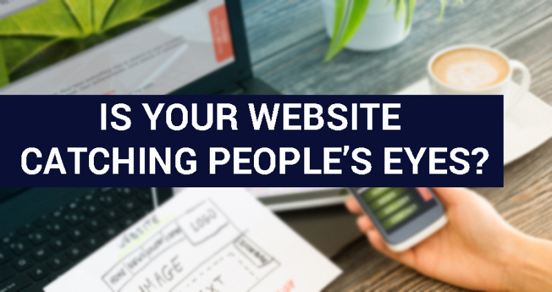
Running or designing a website can be an enjoyable creative process. But it also has to be a strategic one. Whether you’re running something as simple as a personal blog, or you’re hoping to grow a company, chances are you’d like to generate and maintain traffic. And while the content of your site has a lot to do with this, the most important factor is often how the site looks at a glance, or the message it conveys as it’s navigated. So how can you make sure your website is catching people’s eyes?
There are all kinds of different answers to that question. For instance, we could get into the idea that a lot of the more attractive websites these days emphasize negative space, or that big, clear images can help to break up text and hold people’s attention. But rather than discussing theories, we’re going to follow the idea that “good designers borrow, great designers steal.” This was a quote offered by graphic designer Joe Valenzuela in a spotlight of designers talking about different ways to make art and websites stand out. And it’s definitely something to keep in mind.
Extrapolated to the broad idea of making a visually appealing website, we can take this advice as a call to heed inspiration. In other words, it means you should take some time to look at other websites, rather than simply read about design theory, and get a feel for what design strategies are being used effectively.
Here are a few examples to help show you what to look for.
The Ringer – The Ringer is a sports and pop culture site that was actually recently re-designed. Led by an increasingly tech-savvy team motivated to deliver content in a way that will appeal to a modern internet audience, it’s become a fantastic model for any site focused on written work. Actually, in the case of The Ringer, podcast and video content has been subtly emphasized as well. But the written content is front and center, marked not by huge paragraphs on the homepage but by catchy titles, accompanying images, and short blurbs that make you want to read more. The key with written work on a modern website is not to let it turn into clutter. Clutter makes visitors click on to the next website. Here, stories catch the eye like attractive book covers. It’s an excellent example of how to balance images, space, titles, and introductions.
OurLifeCovered – OurLifeCovered is an excellent site in exemplifying how a service can catch the eye. In this case, the service is life insurance, which is not something we tend to associate with positive or appealing imagery. Chances are the words “life insurance” make you think of stressed parents signing policies, elderly individuals wishing to provide for their families, or even grieving families. But none of these images quite make people want to engage with the process of securing a policy! At OurLifeCovered, the colors are bright, the design is straightforward and inviting (a big green “Let’s Go!” button never hurts), and the homepage imagery is almost unrelated to the service at hand. But the overall image is inviting. It makes light of the idea of planning for every eventuality, rather than drumming in the seriousness of it, and in the process it makes you more likely to engage. It’s a nice reminder that with the right logical twist, you can use positive imagery to make any idea stand out.
Boohoo – This is our example for a personal shop or boutique. In this case, it’s a fashion site, and one of the better independent ones you’ll find online. Clothing and accessory sites often tend to look a little bit busier than some other kinds of shops, because a lot of imagery is needed to show products. But here, you’ll get a reminder of the importance of variety in showcasing products. It’s a loud website in ways, with moving parts, coupon codes, and big, colorful images. But it also makes excellent use of the space it has. In about five seconds on the homepage you’ll see current trends, plus-size fashion, discounted items, swimwear, and even a charity effort. That’s all simply through a few seconds’ worth of scrolling, without clicking on any menu item. It’s a brilliant example of how to present options without asking anything of a visitor.
These are just three examples. But again, great designers steal! That doesn’t mean you should go about exactly mimicking these web designs. But you should use them as inspiration for broader ideas to apply to your own platform. They work well if your goal is to catch the eye.

