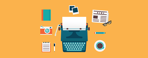
A carefully chosen template is one of the hallmarks of a successful blog and you can never spend too much time weighing the pros and cons of each option. The good news is that today you can find a huge variety of beautiful themes, both free and paid, so there’s no need to hire website designers for the job. However, all this variety can make the selection process quite confusing for new bloggers who aren’t familiar with layouts, fonts and colors. If you’re tempted to pick a random option and stick with it, think again. The way your blog looks influences reader experience, so you shouldn’t leave this to chance. There are a number of factors you have to keep in mind before applying a template, but, before that, you should have an idea on how it should look like based on your niche. That’s right, the things you blog about should be reflected in the aesthetic of the blog. You shouldn’t think of this as something that limits your creativity, but as a guideline for what your readers are used to and what they expect from a compelling blog. Here are a few template tips that you ought to consider depending on your niche.
Personal blogs
Most people wondering how to start a blog are talented writers who want to make their thoughts know to the world and write about the things they are interested in; in other words, personal bloggers. If you have a personal blog, you should pick a template that emphasizes text over images. In terms of layout, the recommended options are either one column, two column or three column templates.

- One column templates are very sleek and minimal and displays strictly the content of each post or a snippet, followed by a footer with an about me section and other such elements.
- Two column templates consist of a larger column taking up about two thirds of the padding (this is where the blog posts are displayed) and a smaller column, which includes an author bio, subscription links, social media buttons, blog archives, follower lists, featured blog posts and other elements. Generally, the two-column option is recommended, because it allows the author to display more information both on the homepage and on individual post pages.
- Three column templates include a large main column in the middle, flanked by two small sidebars on the left and right. They work the same as two-column templates, but differ in that they allow a lot more space for page elements. However, because of all this space, they have the risk of becoming a bit cluttered and distracting the reader from the actual blog post content.
If you’re searching for professional solutions to build a website, have a look at personal WordPress themes.
Review blogs
If you’re really good in a certain field, you can start a blog with product reviews. These are very popular and can even bring you a profit if you are persistent. No matter if you write makeup reviews, smartphone reviews or movie reviews, you should pick a template suitable for this niche. A magazine template ticks all the boxes, because it looks just like an online newspaper, highlighting featured content, videos and photos. However, each individual review has the layout of a conventional blog post. Pick this template if you plan on posting more than one article a day and you want to highlight more content on the homepage.
Portfolios
A portfolio template is essential if you want to post exclusively images or videos. It has an ideal layout that showcases your work in an appealing way. If you are an aspiring photographer, graphic artist or video maker and want to make your work known to the Web, build a professional online portfolio rather than a text-based blog.
Mobile friendliness
If a few years ago responsive templates were optional, now they are a must and you simply cannot expect your blog to have a wide reach if it doesn’t offer a good user experience to mobile visitors. According to Cisco, global mobile data grew by more than 60% in 2016 and is expected to grow even more. So, when choosing a template, make sure it is mobile-friendly. This way, your mobile visitors can enjoy it just as much and you will get more exposure across multiple devices and platforms.
Colors and fonts
After deciding on the general layout of your template, it’s time to more to the creative part of choosing colors and fonts. If you want to play around with these, then use a customizable template that allows you to switch things up. If not, choose a default option. In any case, strive for readability and user-friendliness. Your mission is to make the blog easy to read and follow.
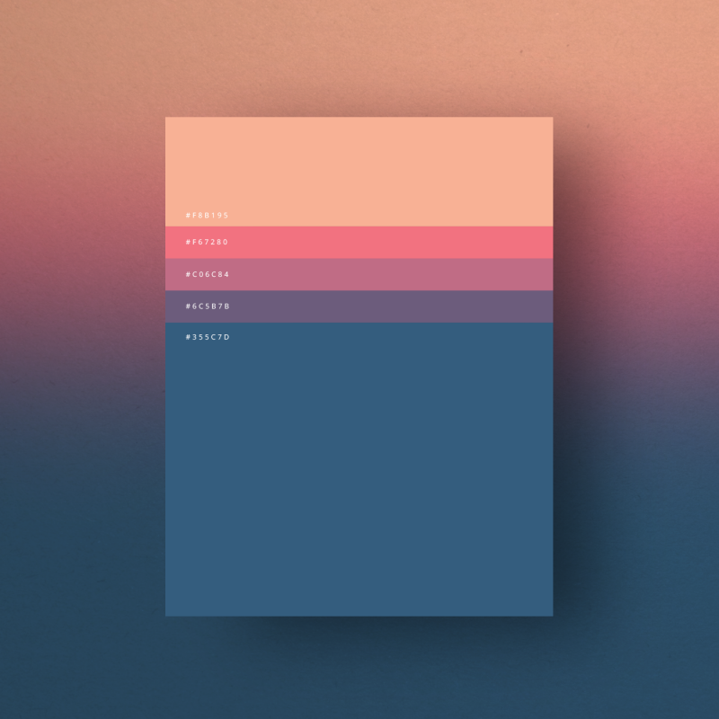
- Certain colors work best with certain niches. Fortunately, template sites have their designs sorted into categories, so you will find everything from arts & makeup to tech and business. You’ll see that tech and business blogs use neutral colors such as black, blue or grey, whereas templates about pets or DIY use colors such as orange, green, pink or red.
- Use black text on a white background. Black backgrounds with colored fonts are very tiresome for the eyes. However, you can use a black background for portfolios, because it makes images pop.
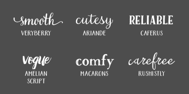
- Stick to a clean, readable font. Intricate, swirly fonts may come across as unprofessional and besides, they’re very difficult to read.
- Take inspiration from other bloggers. Look at famous blogs in your niche and see what kind of layout and colors they use. You shouldn’t steal from them, though.
- A professional design should have a color palette consisting of two, maximum three colors. Anything more than that becomes confusing for the reader.
- Combine fonts carefully. Each font has its distinct personality and you shouldn’t mix two fonts that aren’t complementary. This will create a conflicting image, so the overall design won’t come together nicely.
- Less is more. Use striking page elements with measure and remember that the design shouldn’t overshadow the content. Web users love clean, minimal, simple pages.

